September 18, 2018: Proven gauges of the bull marketAs the current bull market roars into its 9th year, analysts, market pundits and investors, all wonder at one point, how much longer is this run going to go? Gauges for the duration of the bull market vary considerably. Analysts who value fundamentals generally review the levels of Price-to-Earnings (P/E), Price-to-Book (P/B), Debt-to-Equity, free cash flow and the PEG ratio to determine the "true value" of a company. Fundamental analysts are normally not concerned with the overall market or a particular sector but rather focused on determining the value of a single security. However, if these gauges are applied to the S&P 500, the US stock market is currently overvalued. Economists review an equally large set of indicators to determine the health of the economy. Gross Domestic Product (GDP), Gross National Product, productivity vs. spending, unemployment rate, the business cycle and the Consumer Price Index (CPI) are just some of the main indicators that economists will review. A quick appraisal suggests that the US economy is on solid footing with unemployment at near-record lows, GDP is on an up-trend, CPI has fully recovered from the 2009 low and consumer spending is at an all-time high. The two posted charts also indicate that the bull market has more room to run. Chart 1 is a relative strength comparison between the Dow Jones Industrial Average (Dow) and the commodity market (CRB) going back over 130 years. When the Dow is outperforming the CRB (stock cycle), the characteristics are extended bull markets and economic cycles, low levels of volatility, a stable or rising US dollar and less severe (more shallow) corrections. During periods when commodities (CRB) generally outperform stocks (Dow), the corrections in the stock market are usually deeper (40%+), higher probability of inflation over 2%, declining US dollar and shorter business cycles. And lastly, the US Yield Curve (Chart 2). This gauge of economic health has one of the best track records for signally the end of a bull market. The top line is the Curve just before the stock market decline in 2008. It dates at March 01, 2007. What it shows is that short-term rates (1mo to 3mo) are higher than 30yr rates. This action was done by the Fed to slow the economy from overheating. The 2nd lower line is the present US Yield Curve dated September 17, 2018. This is a normal curve and indicates that the Fed has room to raise rates to moderate the growing economy. Bottom line: Depending on the method of analysis (fundamental, economics or technicals), the outlook can vary from overvalued to more room to grow. We feel for most investors, using charts 1 and 2 to roughly gauge when the bull market is near a peak would be helpful. The cycles in chart 1 suggest that the bull market may have another 8 to 10 years of advancing. Chart 2 of the US Yield Curve is harder to predict as to when the Curve will be flat or inverted. The Yield Curve can be followed at: https://www.treasury.gov/resource-center/data-chart-center/interest-rates/Pages/Historic-Yield-Data-Visualization.aspx | 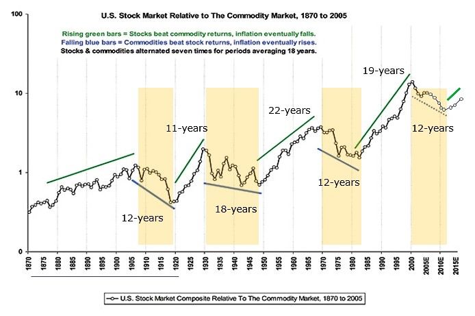 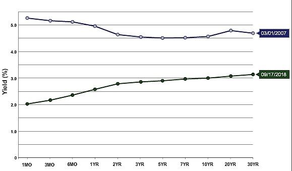 |

|
| |
|
D.W. Dony and Associates
4973 Old West Saanich Rd.
Victoria, BC
V9E 2B2
|